Ravissant: Tales of Avadh
A brand campaign on cultural identity and the art of the telling detail.
Client · Ravissant
Industry · Luxury Retail / Fashion
Team · Bosky Doshi, Enterprise Nexus Mumbai
My Role · Art Direction
Methods · Campaign concepting, visual direction, art direction on shoot
Timeline · 2003
Outcome · Loved and extended from three print ads to a full retail collateral system across Mumbai.
Ravissant is India's first luxury designer label founded in Mumbai in the early 1980s by Ravi and Mina Chawla, and built over two decades into a name that stood alongside Dior, Hermès, and Cartier in the vocabulary of Indian luxury. The Tales of Avadh collection brought together rare ikats and hand-embroidered chikankari stoles evoking the opulence of 18th century Lucknow. This was not a new brand finding its voice.
This was an institution launching a collection and the campaign needed to be worthy of both.

The brief was a collection. The answer was a painting.
The Challenge
A brand with Ravissant's stature doesn't need awareness. It needs a campaign that deepens the mythology. The Tales of Avadh collection was rooted in Avadhi court culture a world of extraordinary refinement, colour, and ceremony. The challenge was to find a visual language that didn't just reference that world but genuinely inhabited it, without tipping into pastiche or period drama.
The clothes deserved a frame as considered as the craft inside them.
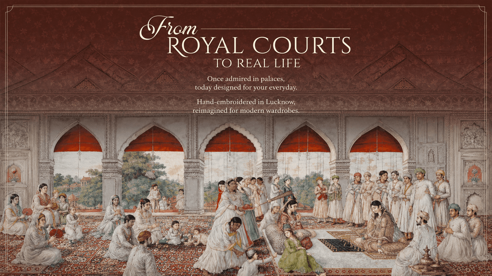

A glimpse of the process
There was no lengthy research phase. Just close reading of the world as it already existed. Flipping through references, the Mughal miniature emerged not as a stylistic device, but as the only visual grammar equal to what the collection actually was. Court compositions. Jewel tones. Figures posed with the stillness of subjects painted for posterity. The idea was already there, hiding in plain sight.
The shoot with photographer Farroukh Chotia became an exercise in building that world, frame by frame.
The insight
Indian luxury in 2003 defaulted to Western visual codes clean backgrounds, European light, aspirational distance. Ravissant had always known better. The insight was simple: the most powerful thing this campaign could do was refuse to apologise for being entirely, unapologetically Indian. The collection didn't need to be framed as exotic or nostalgic. It needed to be presented as exactly what it was the continuation of a living tradition.

The design response
Each execution was constructed as a living miniature — arched frames, flat perspective, richly patterned grounds, figures posed with the stillness of court subjects. The headlines did the rest. A wrong shade of red could have cost a Begum a palace or two. Copy that understood the world it was speaking from. The photography by Farroukh Chotia held the tension between fashion image and painted surface without tipping either way.
The campaign's reception extended the visual world into retail shopping bags, calendar design, in-store collateral, all built inside the same miniature grammar. Those pieces no longer exist in archive. The ads that seeded them do.


The impact
When the industry stopped to look
Campaign loved and immediately extended into retail collateral system
Marked the beginning of a sustained creative relationship between Enterprise Nexus and Ravissant
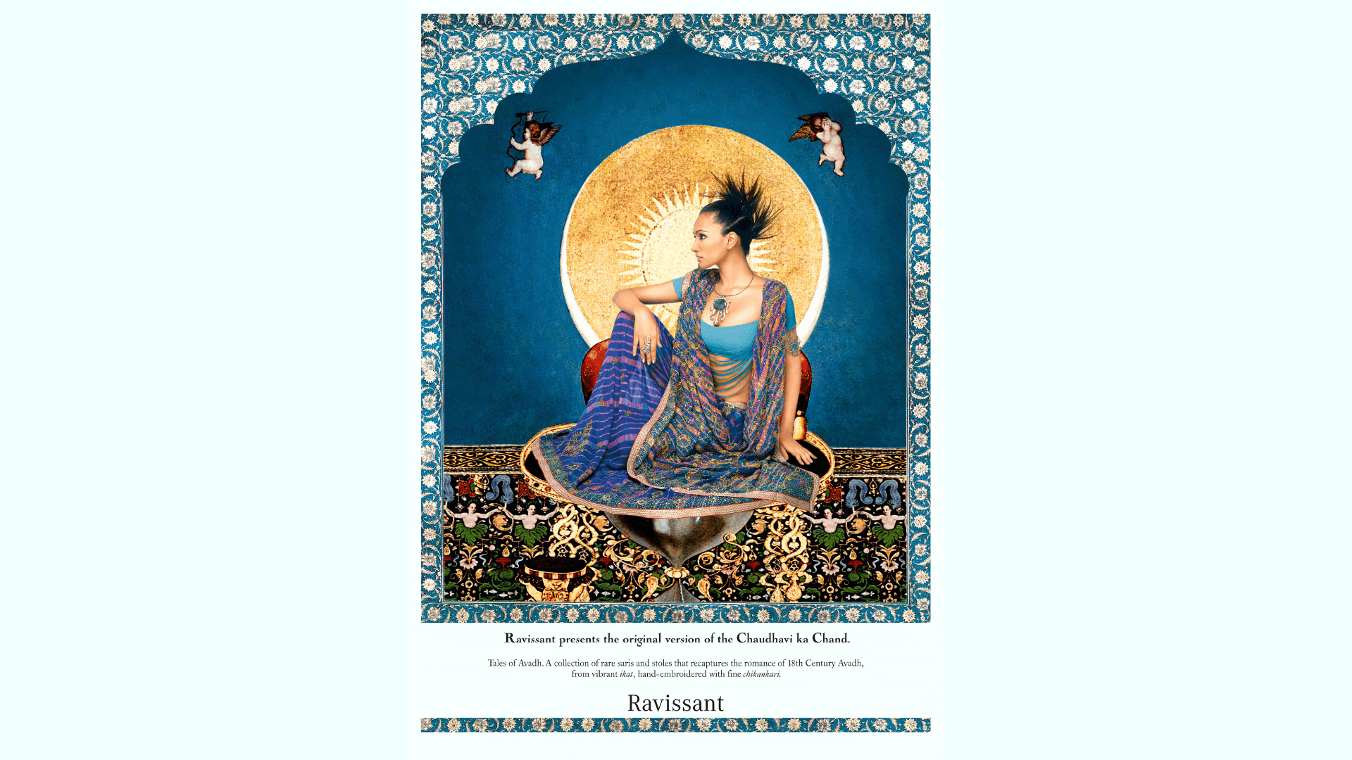
Key takeaways
This was my first shoot with Farroukh Chotia and the first time I understood what art direction really meant. Not arranging. Not supervising. Deciding what world the work lives in, and then building every detail in service of that decision. The miniature wasn't a reference. It was the answer.
That lesson find the world first, then build everything inside it is one I've been applying ever since.

