Kala Ghoda Arts Festival
A brand identity for Mumbai's largest cultural festival
Client · Kala Ghoda Association
Industry · Arts & Culture
Team · Shailesh Khandeparkar - Illustrator, Bosky Doshi - Art Director
My Role · Art Director, Ogilvy & Mather Mumbai
Methods · Craft · Brand Identity, Illustration System, Visual Language
Year · 2007
Outcome · An identity still in active use nineteen years later
Mumbai's largest multicultural arts festival needed a new identity one that honoured a 19th century equestrian statue without feeling like a museum piece. The brief was simple: make it modern, make it scalable, make it last.

A logo made by hand. Still running nineteen years later.
The Challenge
The existing logo was a geometric wireframe of a horse technically interesting, culturally cold. It didn't carry the weight of the district or the warmth of the festival. We needed to redesign from the ground up and extend the identity into a visual language that could carry 12 event categories across the entire festival.

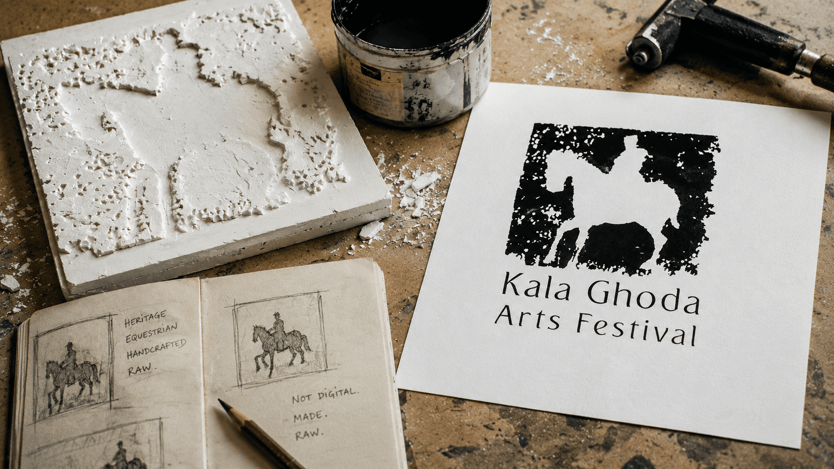
A glimpse of the process
We didn't start on screen. The brief called for heritage — so we worked with our hands. We carved the equestrian silhouette as a groove into thermocal, loaded it with paint, and pressed it. The logo wasn't designed, it was made. Every imperfection in the texture was kept. That rawness was the point.
The insight
The answer was already in the district. Kala Ghoda's streets are lined with carved stone, layered texture, buildings that feel handmade. We stopped looking at logo references and started looking at the neighbourhood. The identity needed to feel like it had been pressed into something not drawn on a screen.

The design response
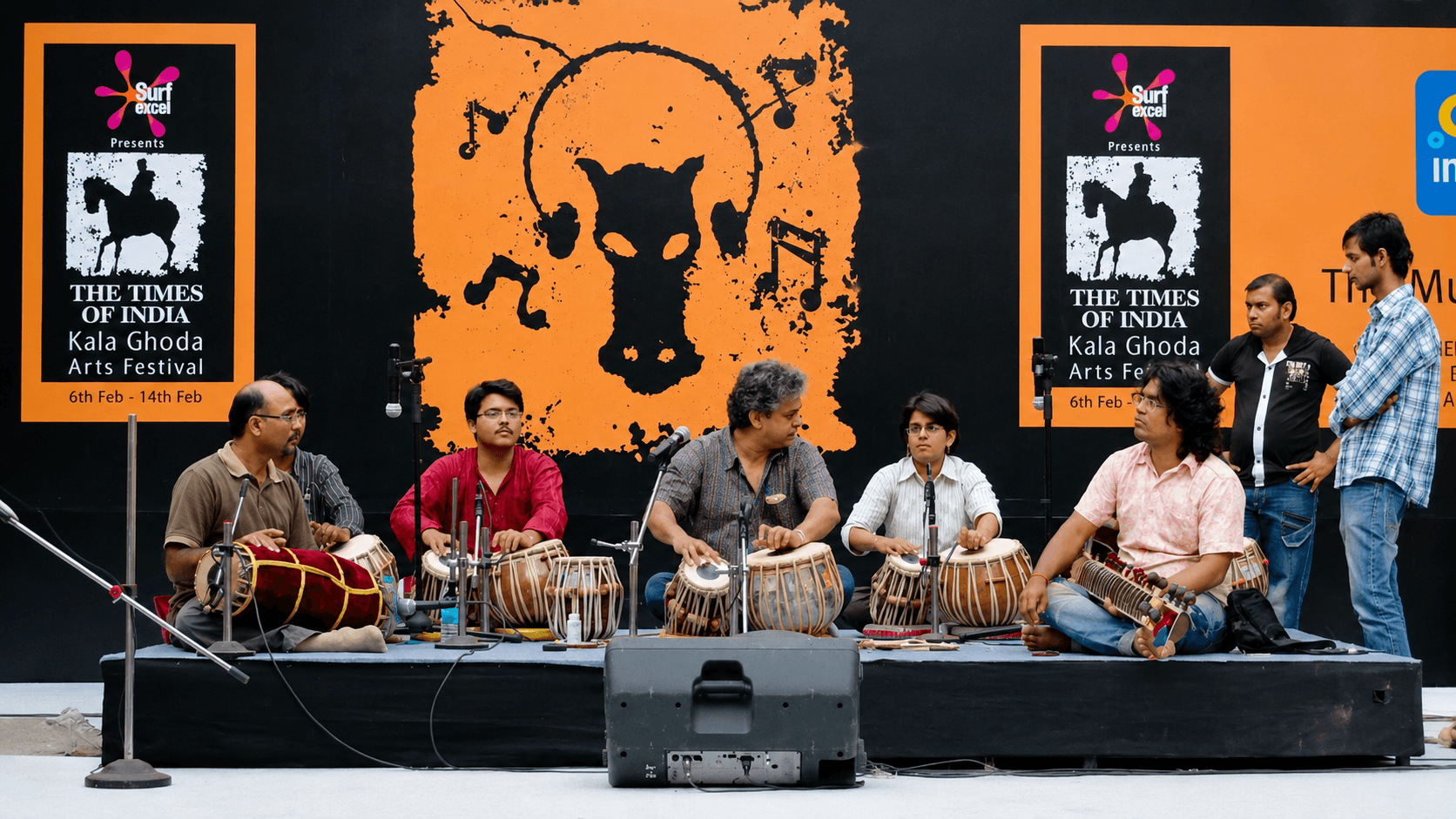
We built the logo using a thermocal painting technique carving a mould, pressing it with paint, capturing the raw texture of the impression. The result was a stamp: the equestrian silhouette inside a field of imperfect, handmade texture. It ran black on white, white on black, and held at any scale. We then extended that same stamp logic across 14 event categories each a different colour, same texture, same hand.


The impact
Created in 2007, the identity is still in active use today visible on signage, print, and the festival website. The Kala Ghoda Arts Festival draws over 150,000 visitors annually from across India and internationally. The stamp and the colour-coded category system have outlived multiple rebrands happening around them.
Key takeaways
The brief said heritage and modern. The neighbourhood said both already exist here, just look.
A handmade process produced a more scalable identity than any digital-first approach would have.
One strong visual logic, the stamp means the system never needs to be reinvented, only applied.
The best brand identities don't describe the thing. They feel like the thing.